
strive365 Brand Identity System
Strive365 is a health and wellness initiative centered around improving daily habits through consistent, long-term behavioral change.
I was responsible for designing the full brand identity system, including logo design, color palette, typography, textures, and adaptable logo variations.
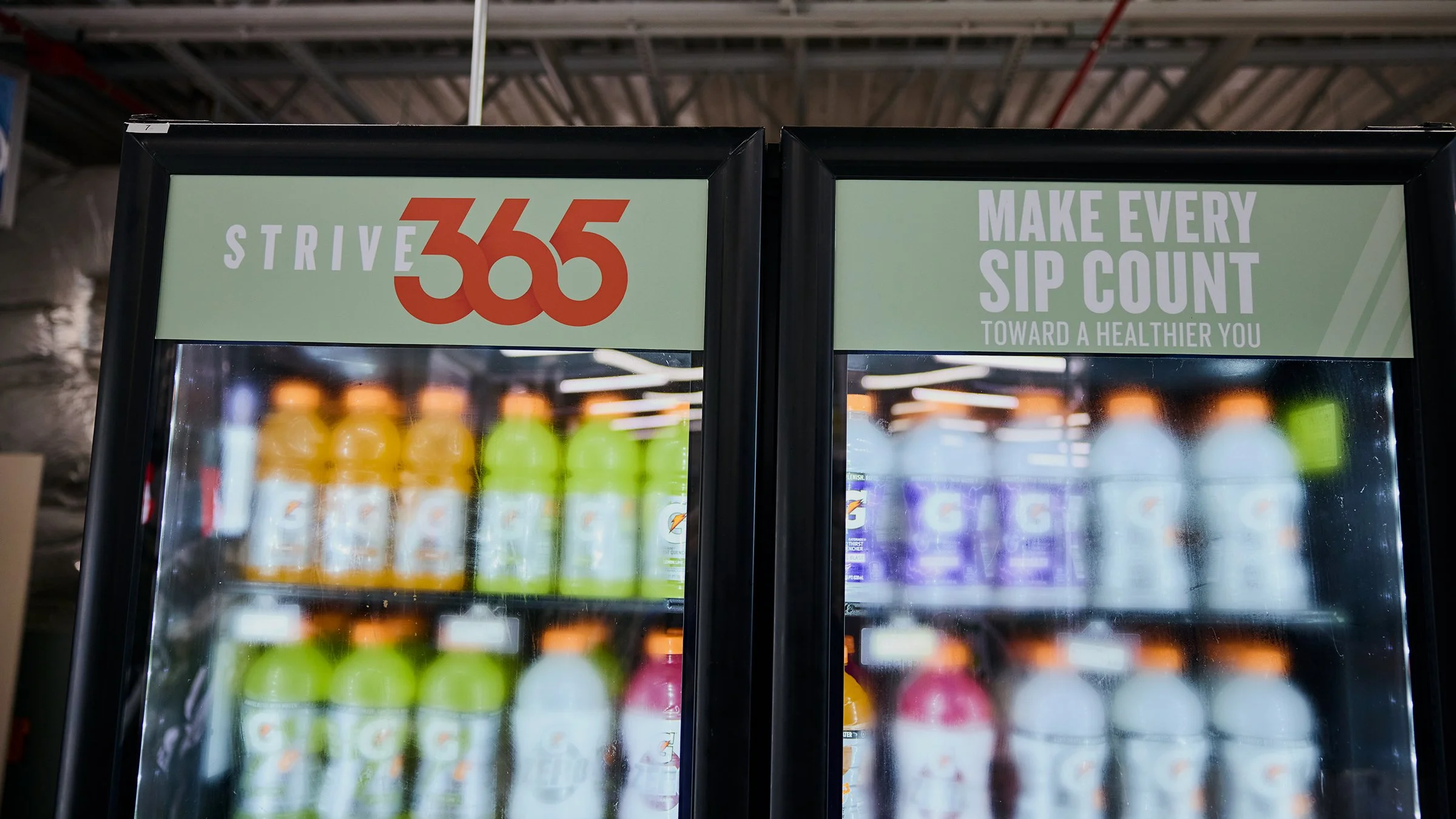
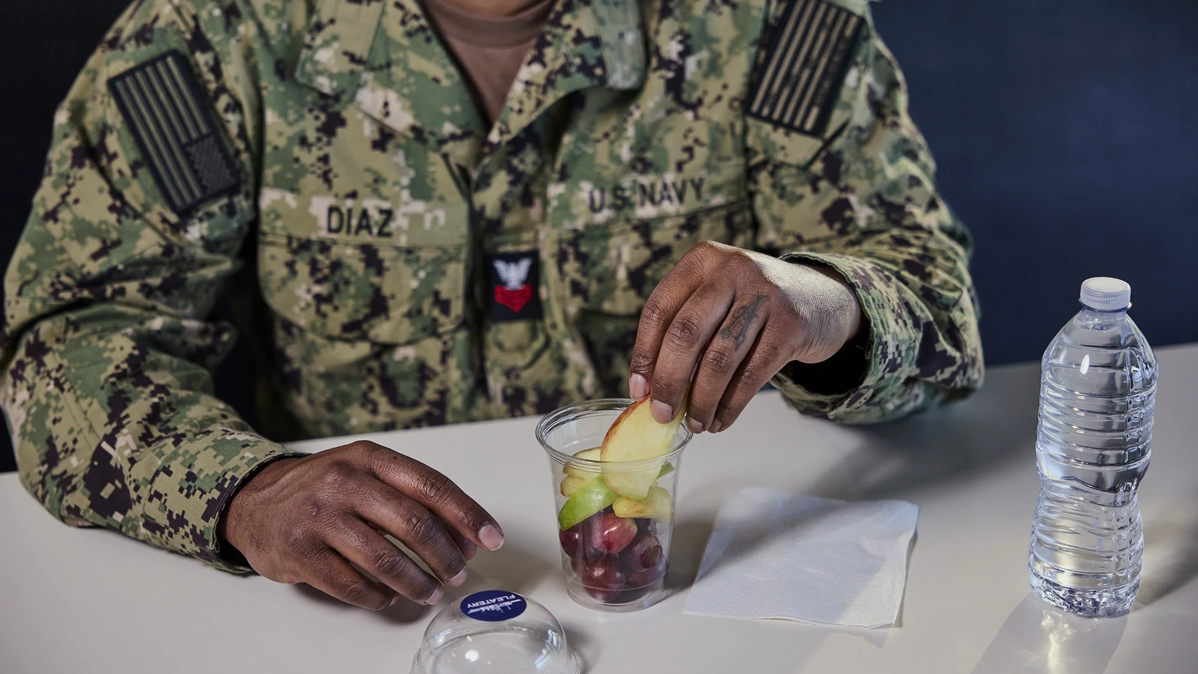
The final identity was chosen over external agency proposals and deployed across in-store environments, showcasing a scalable system that balances conceptual thinking with practical application.
my role : lead brand designer
The Problem & Brief
Strive365 was a new wellness brand we were building, and the goal was to create a stronger internal identity than the agency concepts we had been seeing. It needed to work across a lot of different touchpoints, but more importantly, it had to feel motivating and relatable.
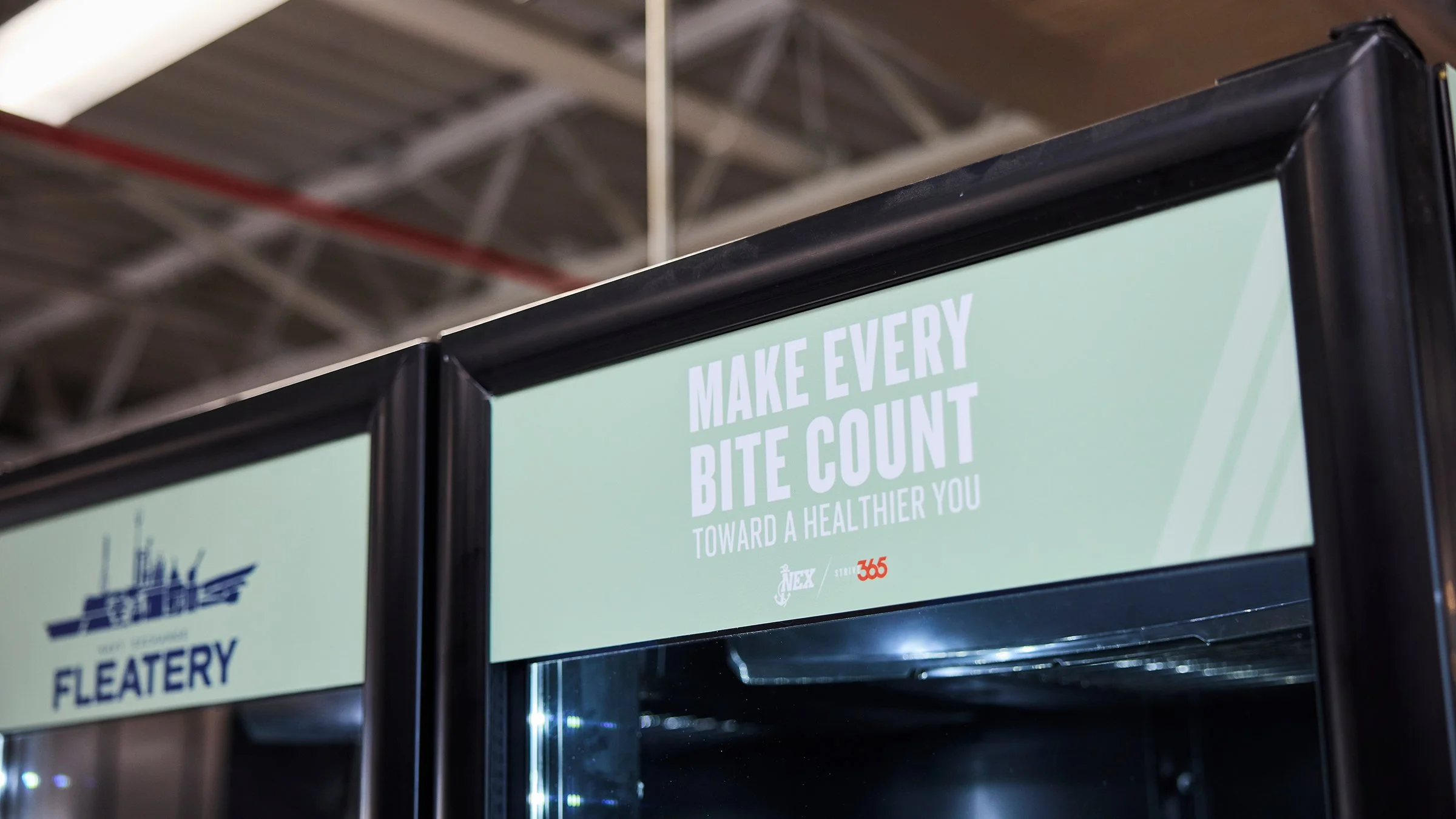
The main focus was encouraging military personnel on base to make healthier choices when visiting NEX marts.
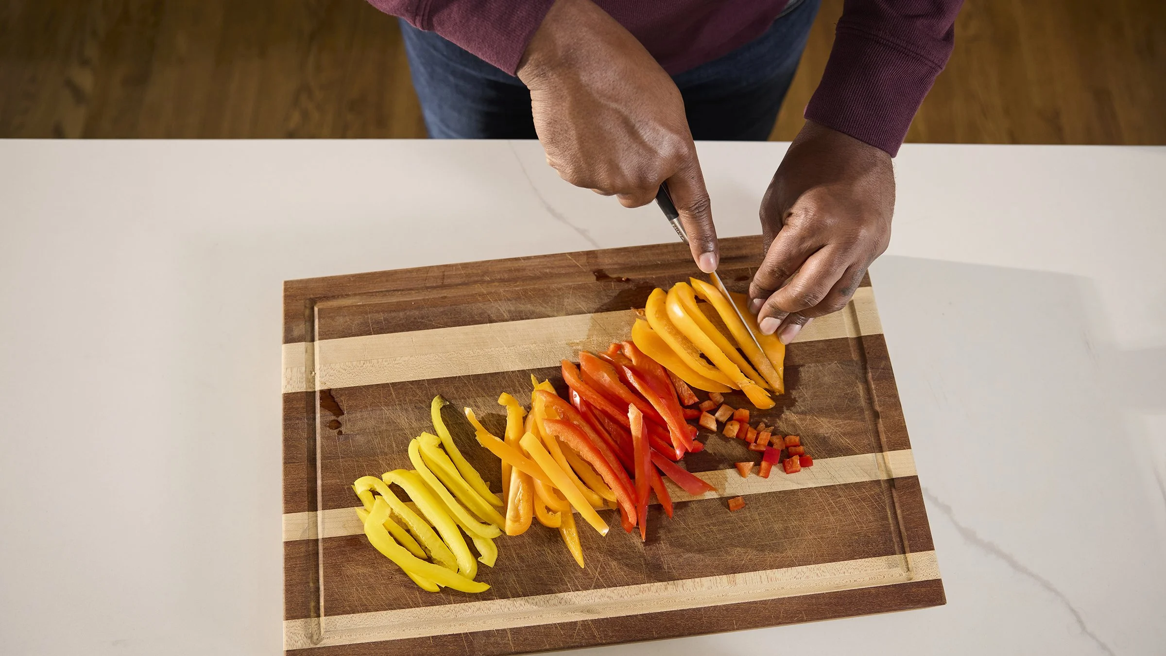
So the challenge was really about creating a brand that could make everyday decisions around health feel more simple, positive, and consistent.
The core idea behind Strive365 came from the concept of consistency — that better health isn’t about one big decision, but the small choices you make every day.
The “365” became the foundation of the identity, representing that idea of daily accountability and ongoing progress throughout the year.
From there, I focused on framing wellness as something approachable and incremental rather than overwhelming. Instead of pushing a strict or clinical health message, the goal was to make it feel achievable — like small decisions adding up over time.

Concept & strategy
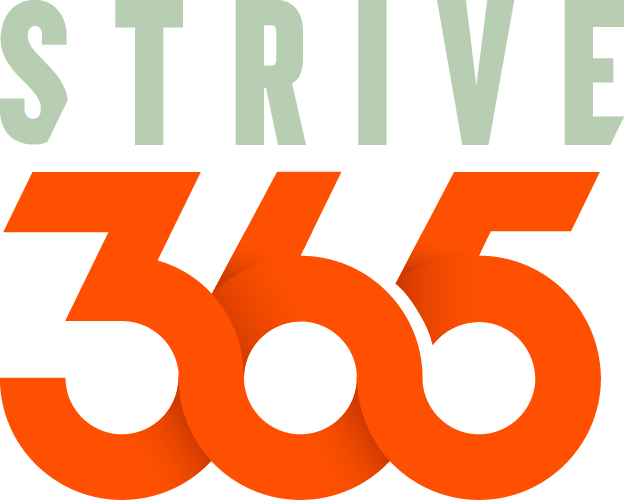
logo design
The logo was built around the idea of consistency and flow, with “365” acting as the core visual element.
I wanted it to feel continuous, almost like a loop, to reflect the idea of making better choices every day rather than treating health as a
one-time goal.

Color system
The Strive365 color palette balances
health-driven calm with energetic action, reflecting the brand’s focus on consistent daily decision-making.
The combination creates a clear visual contrast between stability and momentum, reinforcing the brand’s core idea of small, intentional choices that build toward long-term wellness.
Garden Mint — #b8ceb2
Primary brand color representing health, balance, and sustainable progress. Used as a grounding visual foundation across applications.


Morning Citrus — #fe5000
Secondary accent color representing energy, motivation, and action. Used to draw attention and emphasize moments of decision or engagement.


typography
Typography played an important role in establishing the voice of the Strive365 brand. I selected Knockout as the foundation of the identity because of its strong, condensed structure and high level of legibility. The typeface has an energetic and confident personality that aligns well with the brand's focus on motivation, progress, and personal accountability, while still feeling approachable and modern.
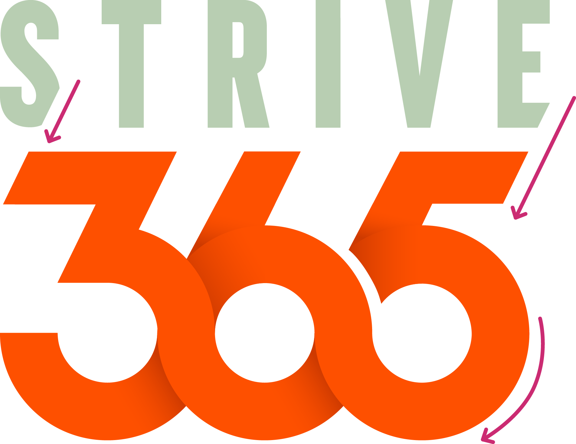

The "365" was designed to resemble a running track, tying the logo back to themes of movement, progress, and healthy habits. Its continuous form reinforces the idea that wellness is an ongoing journey built through daily choices and consistent effort.

For the primary logo, the wordmark utilizes Knockout to create a bold and recognizable presence. The "365" portion began as the same typeface before being customized in Adobe Illustrator to create a more continuous and connected form.
Another key design element was the incorporation of our company's signature 26-degree slash. Small sections were removed from the "S" and "E" in Strive, and all diagonal cuts throughout the logo were constructed using the same 26-degree angle found across the broader corporate identity. This subtle detail helps connect Strive365 back to its parent brand while allowing it to maintain its own personality and purpose.