


navigation architecture
Navy Exchange Navigation Redesign
the challenge?
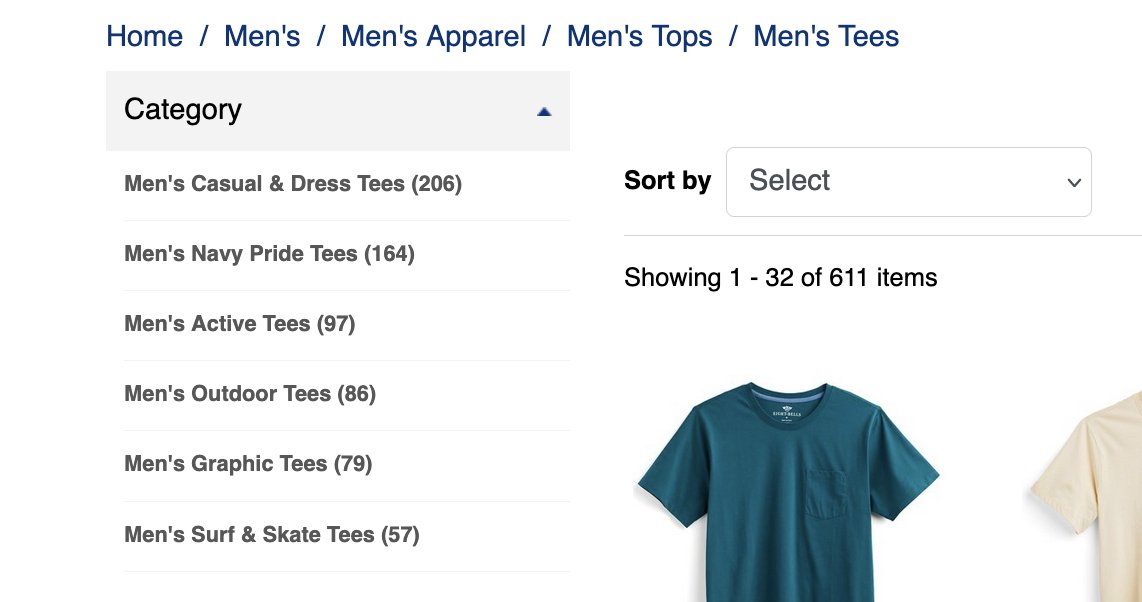
The Navy Exchange site relied on breadcrumb navigation to help users move between categories. Testing revealed that this pattern was not effectively supporting category exploration and often went unnoticed by users. The challenge was to create a more visible navigation experience that improved discoverability while remaining scalable across the site's category structure.


my role
UX Wireframing
Information Architecture
UI Component Design
Visual Design
Category Page Optimization
Ongoing Component Maintenance
research
User testing indicated that breadcrumb navigation received limited engagement compared to other page elements. This suggested an opportunity to surface category pathways more prominently and reduce the effort required for users to explore related product areas.
wireframes & exploration
I developed a series of wireframes to explore alternative navigation patterns and evaluate how category options could be integrated directly into landing pages. The focus was on creating a clear visual hierarchy that balanced category discovery with merchandising and content priorities.
solution
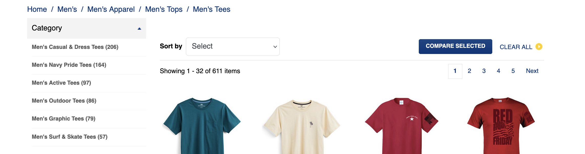
The final solution replaced breadcrumb-dependent navigation with a series of category panels positioned prominently within each category landing page. These panels surfaced relevant navigation options at the point of entry, making it easier for users to explore related sections of the site. The design established a consistent navigation pattern that could be applied across all product categories while maintaining flexibility for varying content needs.
system thinking
To support implementation across the site, the category panels were designed as reusable UI components. I established layout structures, content rules, and visual patterns that allowed the solution to scale consistently across numerous category pages. The component framework also streamlined ongoing updates and maintenance efforts.